
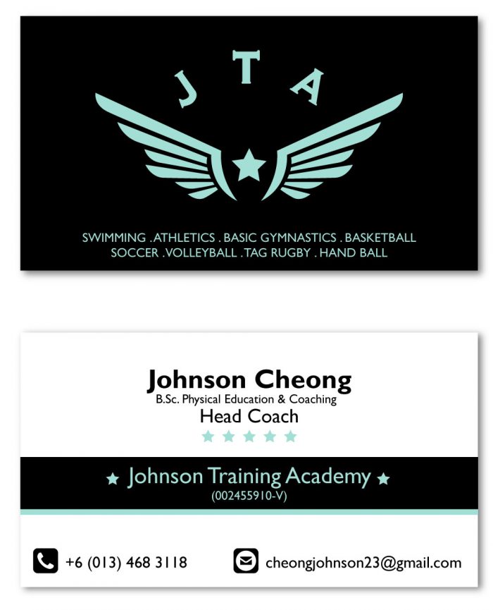
Johnson Training Academy
Namecards are tricky, some printers actually offer free namecard designs to clients in return for printing with them. It is fair but you do get what you pay for. Here is a recent namecard design for Johnson Training Academy (JTA) who does training for swimming, athletics, gymnastics, basketball, soccer, volleyball, tag rugby and hand ball. Quite an amazing selection, so if you are looking for quality training, do hit them up.
Blog Ad Wars
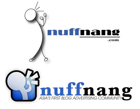
Just remembered an old Logo Design I did for a local blog ad network called Nuffnang years back. There was some drama on the blogosphere (wonder if people still call it that?) and two blog advertising networks appeared. Both started going at each other’s throats and as an innocent bystander, I picked Nuffnang to back as the other chaps seemed pretty arrogant and had some pretty unscrupulous methods. So I sent off a new redesign of their initial logo (the one above) which was honestly horrible and I was pretty happy to see it still being used til this day. Would’ve been great if I earned something out of it but as a designer, I’m glad it provided value to someone.
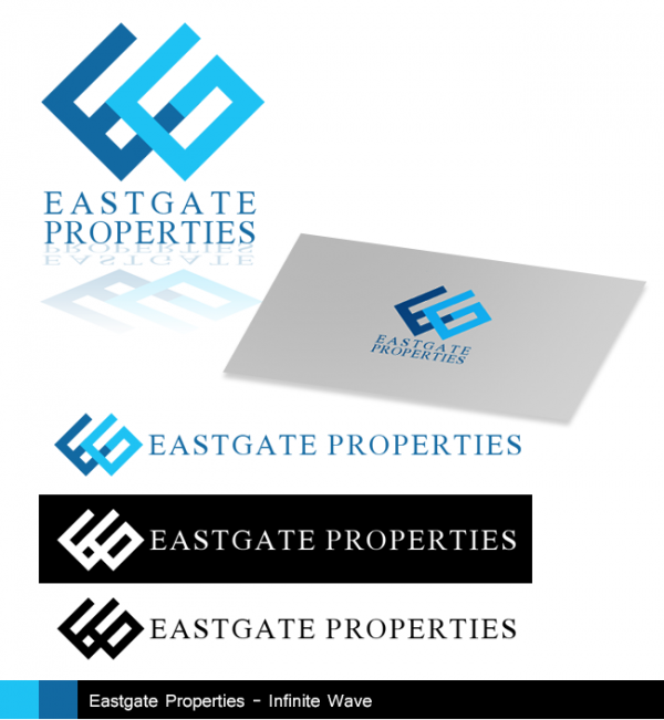
Eastgate Properties
Another more serious Corporate Identity for a Property Developer. Infinity and Flowing were important to the design.
Tomes of Academia
There are many resources available to researchers and its going to be a long and arduous journey sifting through to find relevant research papers. There is a large difference between citing academic journals and citing internet sources or books. Academic journals have been peer reviewed by others in academic while most of my current sources are from websites and other non-academic sources. This is going to be one of my largest weaknesses which is the lack of a formal proper academic background. I’ve never had to do a dissertation so far and a 25,000 word thesis is going to be a massive pain.
Well, one of the recommended academic journal databases recommended by my supervisor was Ethos, http://ethos.bl.uk.
Thankfully KDU library also subscribes to a large number of databases so my next step is to start collecting literature to better understand my topic and redefine it.
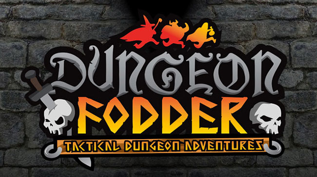
Also here is the finalized version of my logo. It should be less serious, while also impressing upon those that like Role-playing games and the fantasy genre that it is a light-hearted take on adventuring in a dungeon. I’ve also added the three ‘flee’ing characters above to represent the three playable classes in the game.
Digging up Dungeons
Rejuvenating an old project for a research project brought back many memories. Time to start cracking at it.
I’ve got about 2 weeks to begin testing phases.
![]()
Logo Design – Dungeon Fodder
The silhouette is an important part of what I think about when putting together logos and designs. Assuming the logo stands-alone, will be sufficient to communicate it’s message? For the Dungeon Fodder logo, I’ve decided to go with a traditional fantasy-typeface and play around with illustrated components instead. Skulls are a definite must-have for any respectable dungeon and the standard version (vanilla version) of Dungeon Fodder will feature three classes which are the iconic Warrior, Rogue and Wizard.
![]()
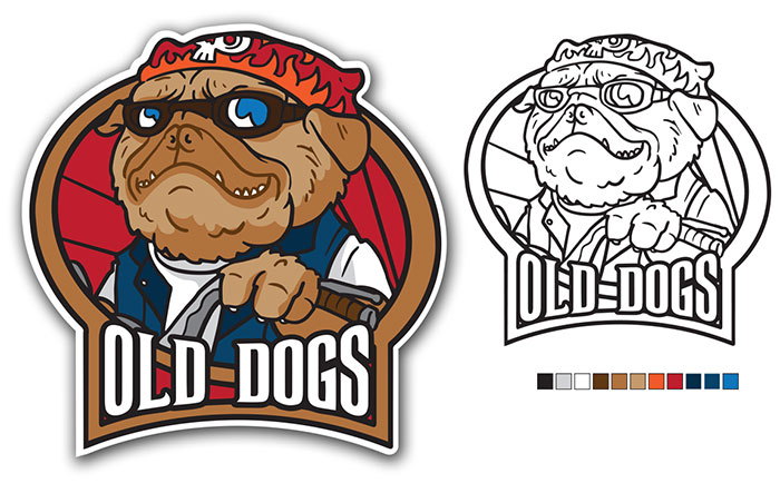
Smug Pug
Old Dogs is a biker group that’s quite unlike what one might imagine. Wild days aside, they are now professionals with stellar careers but the passion for riding still burns in them. This patch is a commission to all those out there with a love for life on the wild side.
MGDC Logo
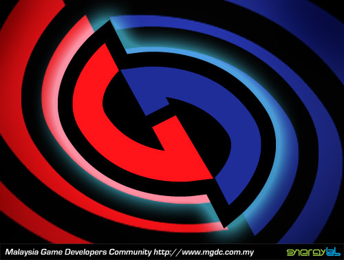
Another little thing that I neglected to post up,… The Logo represents a G and a D entwined in a never-ending loop. The G of course is for Games and the D is for the Developers out there. The colours was initially drawn from our national flag but since that got too corny, it’s primary reason is because of the lovely contrast it gives the logo. And of course the thick set heavy outlines are something I love to foist upon any Logo I get my hands on. And lastly, it is meant to convey a sense of dynamism kind of like something a Superhero would use on their spandex outfits. Something that stands out and yells, LOOKIT’ ME!…
Do visit the forum and contribute at http://www.mgdc.com.my/forum/ . Til’ next week on THE WONDERFUL WORLD OF LOGOS!
Boxed Ammunition
![]()
A minor commission by the chaps at Ammobox Studios who are working on an amazing RTS/FPS Hybrid called Project Combine which you can check out here. The bullets were supposed to look like people standing together to represent the ‘team’ while also emphasizing the Ammo portion of their identity.