
MGDC Logo
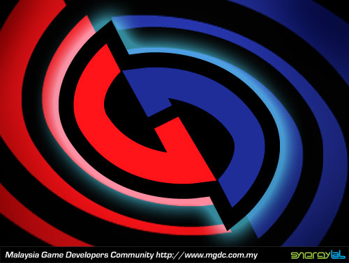
Another little thing that I neglected to post up,… The Logo represents a G and a D entwined in a never-ending loop. The G of course is for Games and the D is for the Developers out there. The colours was initially drawn from our national flag but since that got too corny, it’s primary reason is because of the lovely contrast it gives the logo. And of course the thick set heavy outlines are something I love to foist upon any Logo I get my hands on. And lastly, it is meant to convey a sense of dynamism kind of like something a Superhero would use on their spandex outfits. Something that stands out and yells, LOOKIT’ ME!…
Do visit the forum and contribute at http://www.mgdc.com.my/forum/ . Til’ next week on THE WONDERFUL WORLD OF LOGOS!